株式会社 株プロ
Brand Communication Design
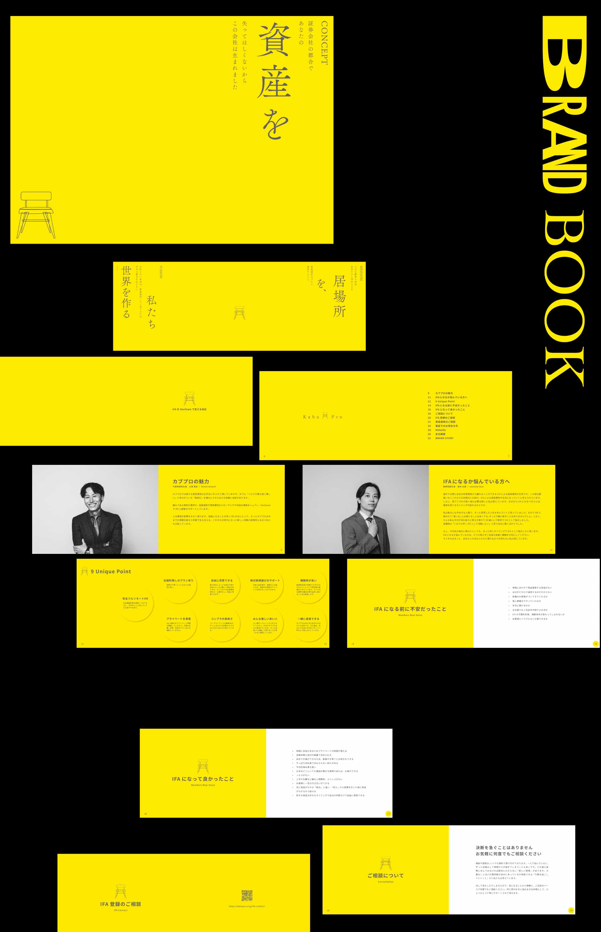
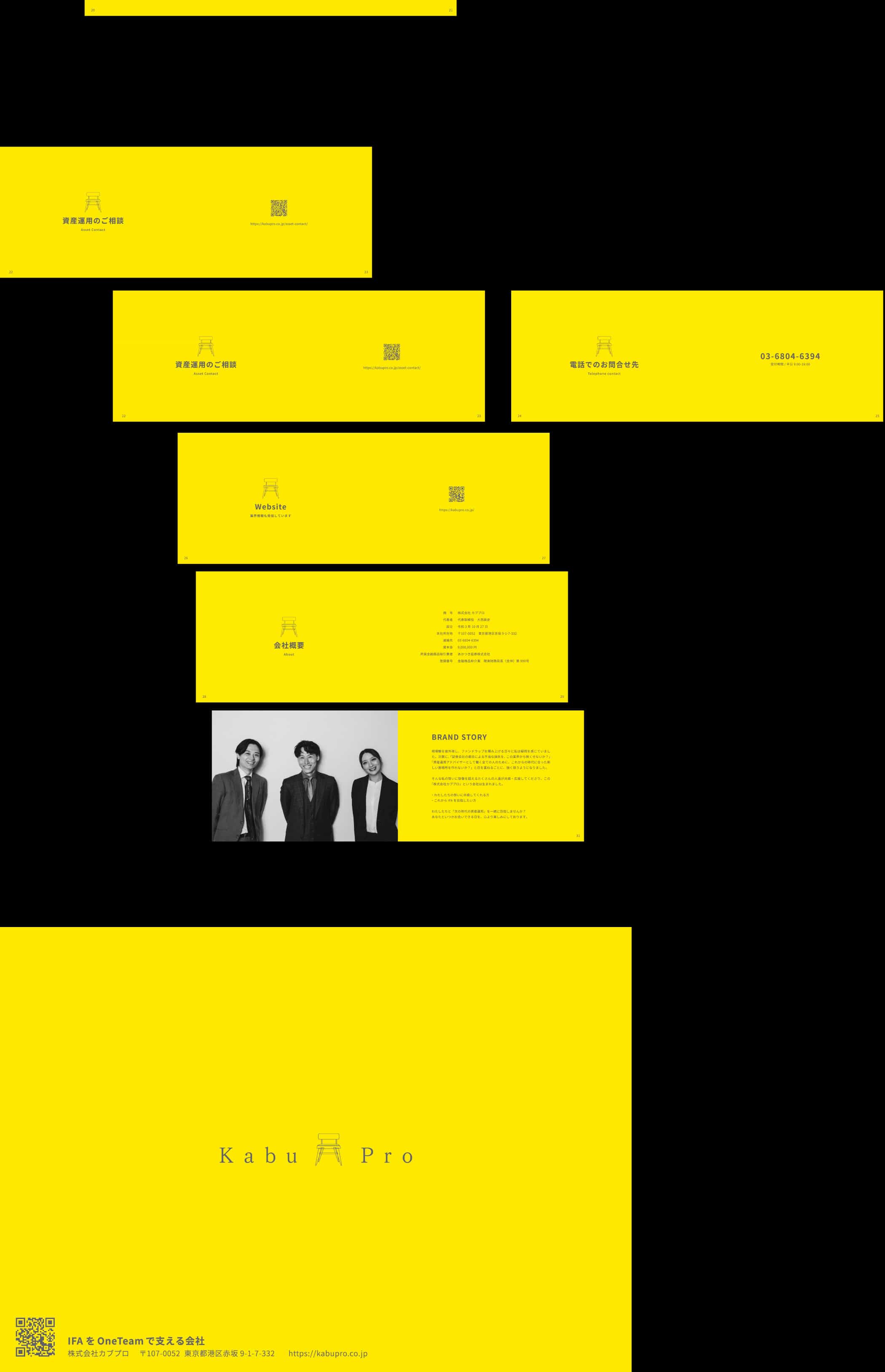
東京都品川区に拠点を置く、資産運用アドバイスおよびIFA仲介業を行う「株式会社 株プロ」様の企業スタートアップのお手伝いをさせていただきました。
ブランドコミュニケーションデザインとして、Webサイト(別記事にて紹介)、ブランドブック、名刺制作までを一貫して手掛けています。
本プロジェクトでは、既存のIFA仲介業界に多く見られる、画一的でやや硬質なデザインから距離を取り、新たな志をもってスタートアップする「株プロ」の思想や価値観を、コンセプト設計の段階から再構築しました。
色使いやコピーを含め、従来の業界イメージにとらわれない、革新的なブランド表現を取り入れることで、「資産運用=数字」ではなく、「人と向き合う姿勢」が伝わるデザインを目指しています。
ブランドコミュニケーションデザインとして、Webサイト(別記事にて紹介)、ブランドブック、名刺制作までを一貫して手掛けています。
本プロジェクトでは、既存のIFA仲介業界に多く見られる、画一的でやや硬質なデザインから距離を取り、新たな志をもってスタートアップする「株プロ」の思想や価値観を、コンセプト設計の段階から再構築しました。
色使いやコピーを含め、従来の業界イメージにとらわれない、革新的なブランド表現を取り入れることで、「資産運用=数字」ではなく、「人と向き合う姿勢」が伝わるデザインを目指しています。
As part of the startup support for Kabupro Inc., an investment advisory and IFA brokerage firm based in Shinagawa, Tokyo, I was involved from the early stages of brand development.
I led the brand communication design across multiple touchpoints, including the website (introduced in a separate article), the brand book, and business cards, handling the process in a fully integrated manner.
In this project, I intentionally moved away from the uniform and somewhat rigid design language commonly found within the IFA brokerage industry, and instead reconstructed Kabupro’s philosophy and values from the concept-design stage, reflecting the company’s fresh vision as a new startup.
Through the use of unconventional color palettes and carefully crafted copy, the brand expression challenges traditional industry norms.
The aim was to create a design that communicates not “asset management as numbers,” but a human-centered approach—one that emphasizes trust, care, and genuine relationships with people.